Chapter 11: Type as a Design Element. Chapter 12:Color essentials
1. Custom Swatches Assignment
Below are my two spot colors.
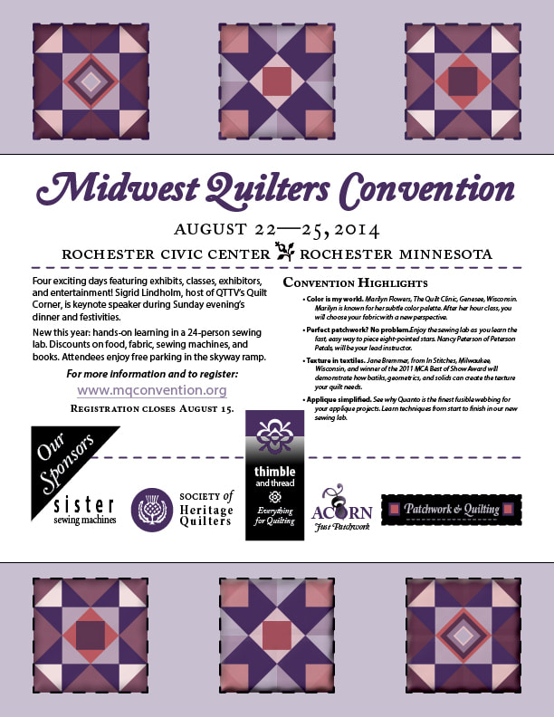
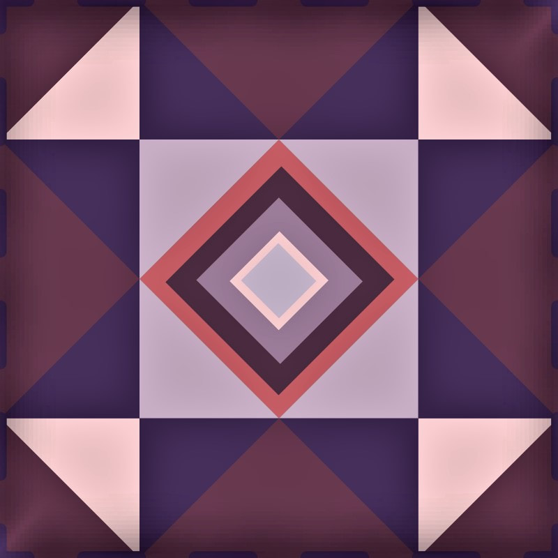
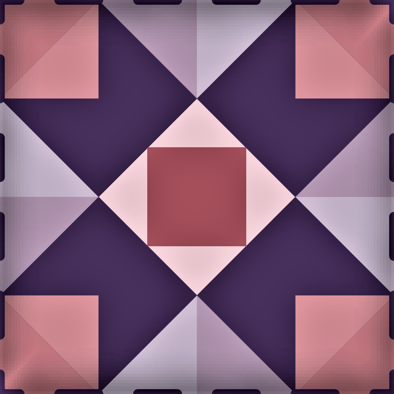
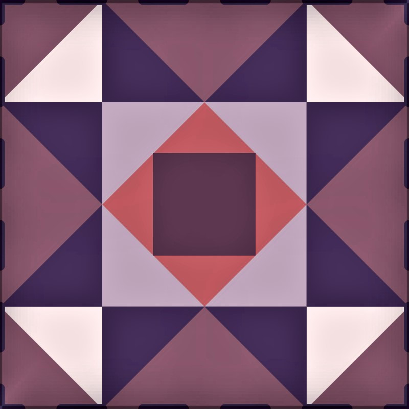
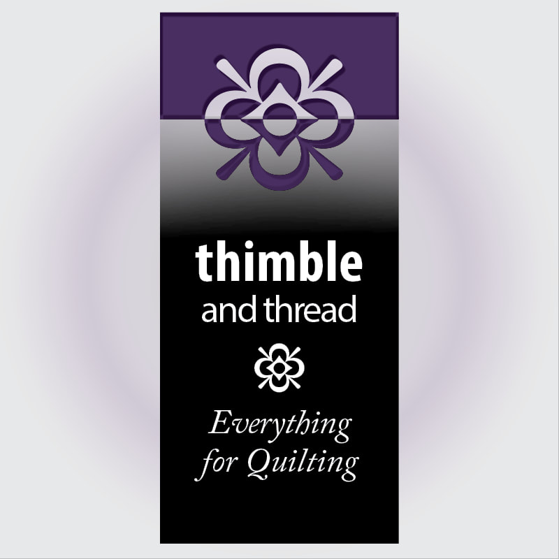
2. Quilters Convention Assignment
Here are those fun little logos for the convention assignment. I really had to dig-in on the Pathfinder tool. I can't believe all of these graphics were made from only two colors - not counting black and white. Amazing!
3. The Color Challenge Assignment
The less colored image (left) I put together using Adobe InDesign adjusting saturation, opacity, layout and color. The image (right ) I used Photoshop CC and justed color, layers, and opacity. For this project, I feel Photoshop is the way to go to adjust graphics and InDesign is great for design & layout. Visually comparing both, I prefer the more colored (right image) but I can see how the cost of printing would be more. This was a great lesson.
Customer came back and wanted to try a different background image. The below is a different background "draft" prior to licensing the image (just in case there might be future changes/swaps.) My thoughts, No problem-o. Still within print budget.